前言
这篇文章介绍一些字体相关的内容
字体是什么
字体都是通过一些文字制作软件制作的,是一些点阵的结合
你可以使用FontForge来查看和编辑字体文件
参考线
在学习英文字母时,我们使用的单词本是几条横线的,这就是参考线的一种,同样的,在设计字体时也有参考线的存在
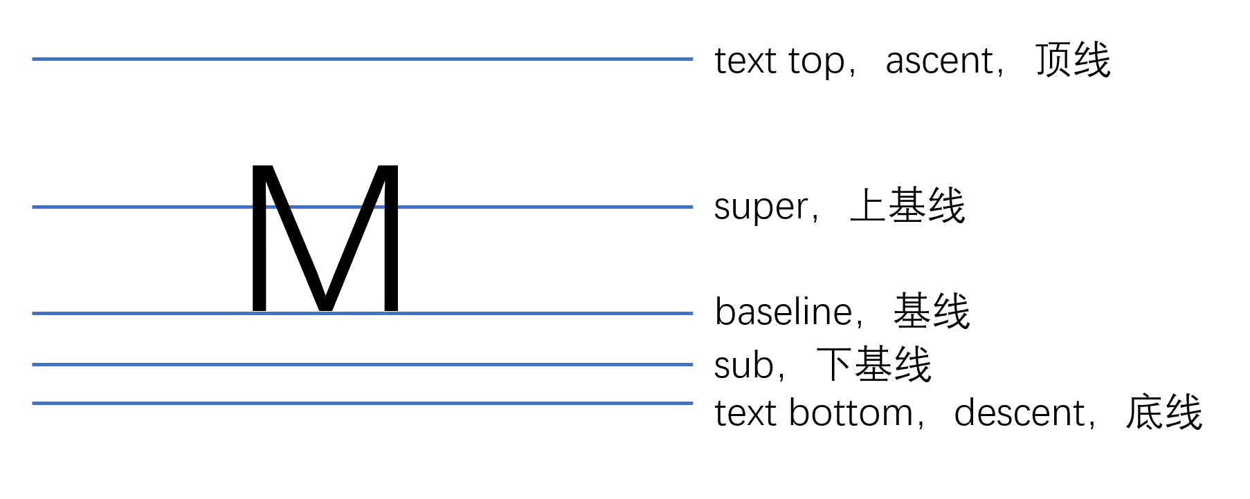
这些参考线的位置都是字体设计者自己定的,对于不同的文字类型,参考线不一样。同一种文字类型,参考线一致。
字体大小和参考线
那么参考线有什么用呢,有很重要的一点是对应字体大小
首先我们要知道,字体设计时是使用相对大小的
这里有几个值可以注意下
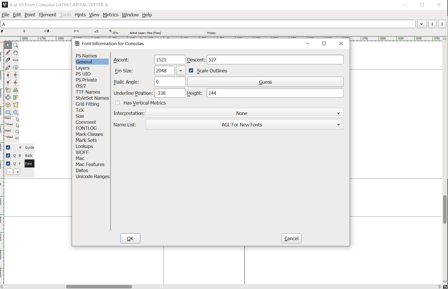
- Em Size:字体的相对大小,一般是1000、2048、1024这些
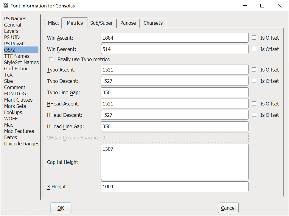
- Win Ascent:Window系统下顶线离基线的相对长度
- Win Descent:Window系统下底线离基线的相对长度
文字顶线到底线的距离,就是文字的实际大小
也叫作文字的内容区(content-area)
你可以用活字印刷的例子来理解它们的概念,在最初设计字体时,会刻录下一个个文字模板
这里的Em Size就可以理解成文字的框,设计者在这个框内设计文字,这个框的大小只是用于和文字的真正大小进行比例处理,真正印刷时会对这个框里的文字按照比例进行缩放
在浏览器中,font-size设置的就是文字的框的大小,而不是文字的真正大小
什么意思呢,如果有下面的代码
1
2
3
4
5
6
7
8
9
10
11
12
13
14
15
16
17
18
19
20
21
22
23
24
| <!DOCTYPE html>
<html lang="en">
<head>
<meta charset="UTF-8">
<meta name="viewport" content="width=device-width, initial-scale=1.0">
<meta http-equiv="X-UA-Compatible" content="ie=edge">
<title>Document</title>
<style>
span {
font-size: 200px;
background: lightblue;
line-height: normal;
font-family: Consolas;
}
</style>
</head>
<body>
<p>
<span>A</span>
</p>
</body>
</html>
|
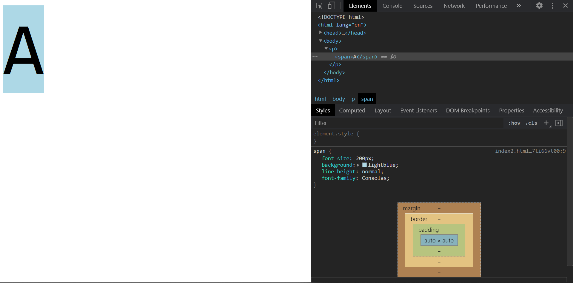
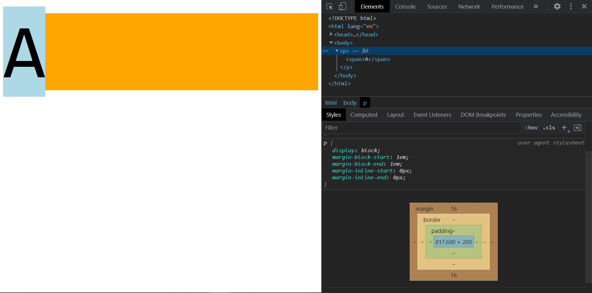
你会发现这个span的高度是234px,这是为什么呢
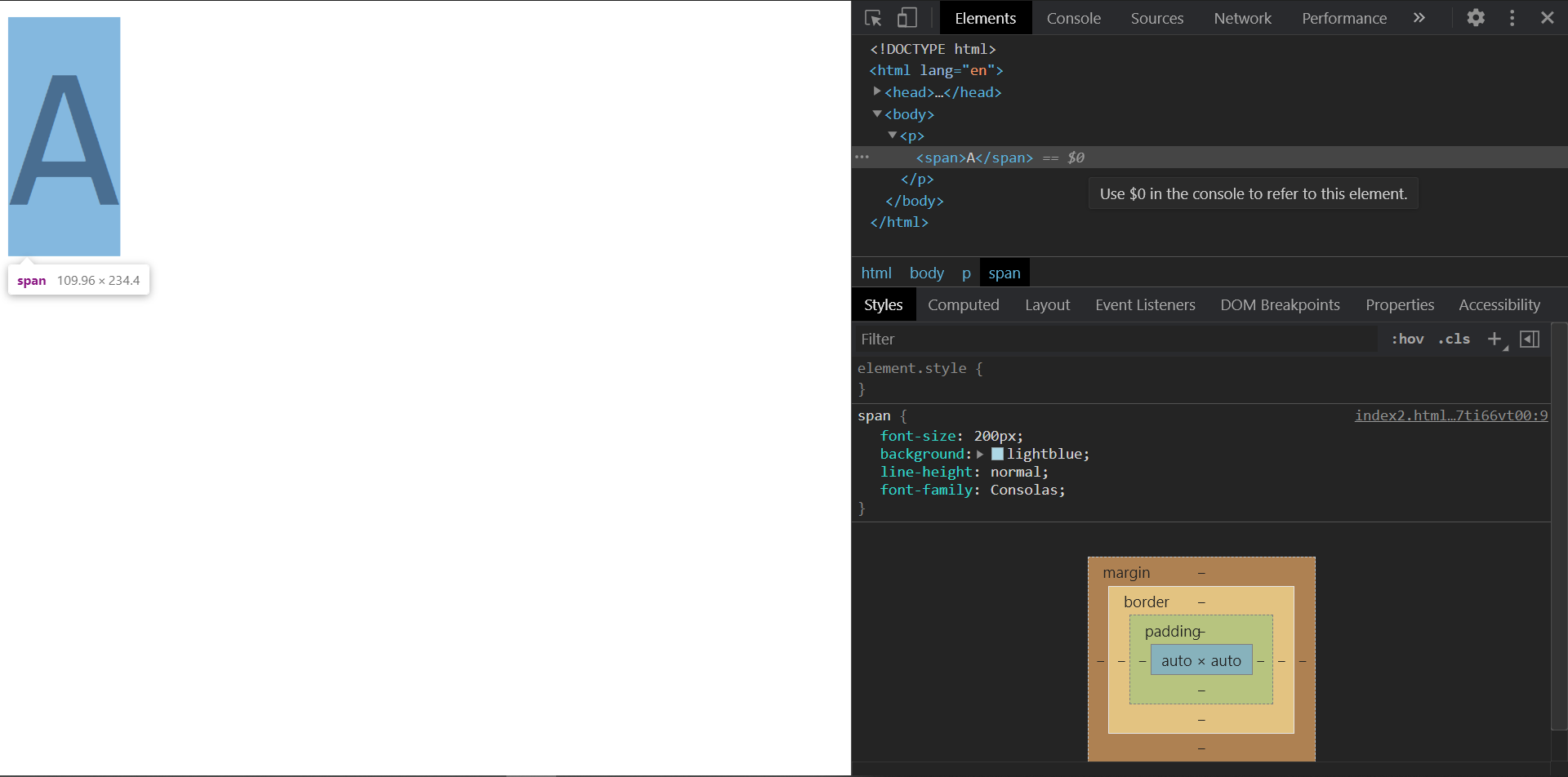
这就是为什么我说font-size设置的是相对大小了,用活字印刷术的例子来看,font-size是文字框的大小,而文字在设计时是有可能超出文字框的,在等比缩放后,自然会超过font-size设置的大小
文字的实际大小是内容区(文字顶线到底线的距离),我们可以算一下
200 * ((1884 + 514) / 2048) = 234.1796875
另外,你要注意
行盒的背景,覆盖的是content-area
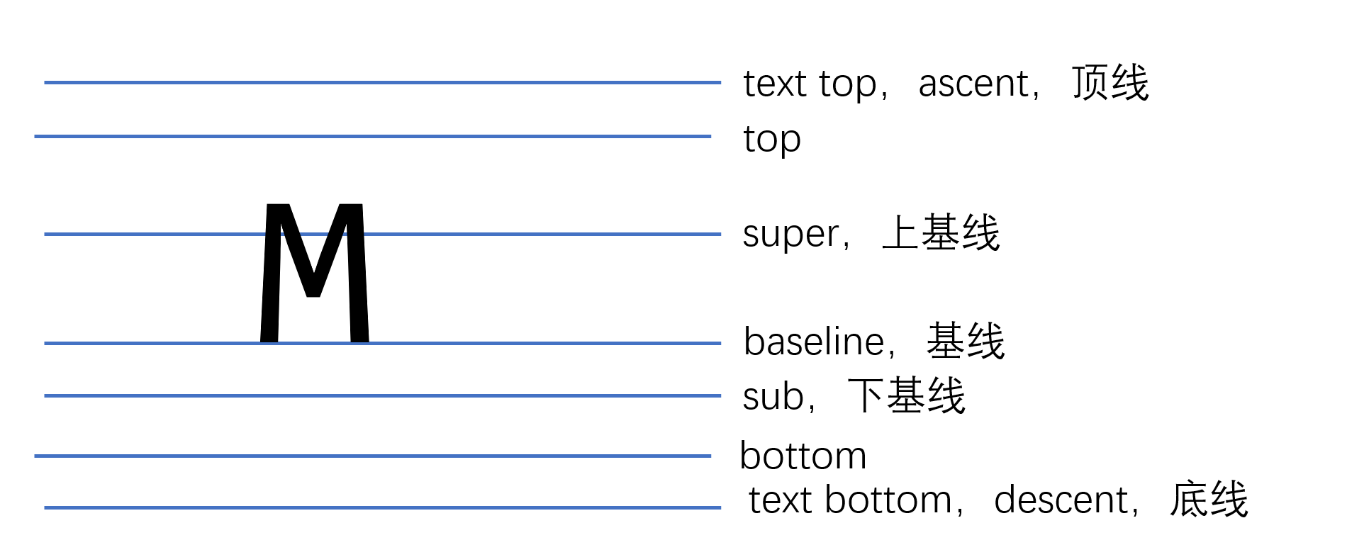
行高
在顶线向上延申的空间,和底线向下延申的空间,叫做line gap(空隙),这两个空间相等
line gap默认情况下,是字体设计者决定的,top到botoom之间的区域,叫做virtual-area(虚拟区)
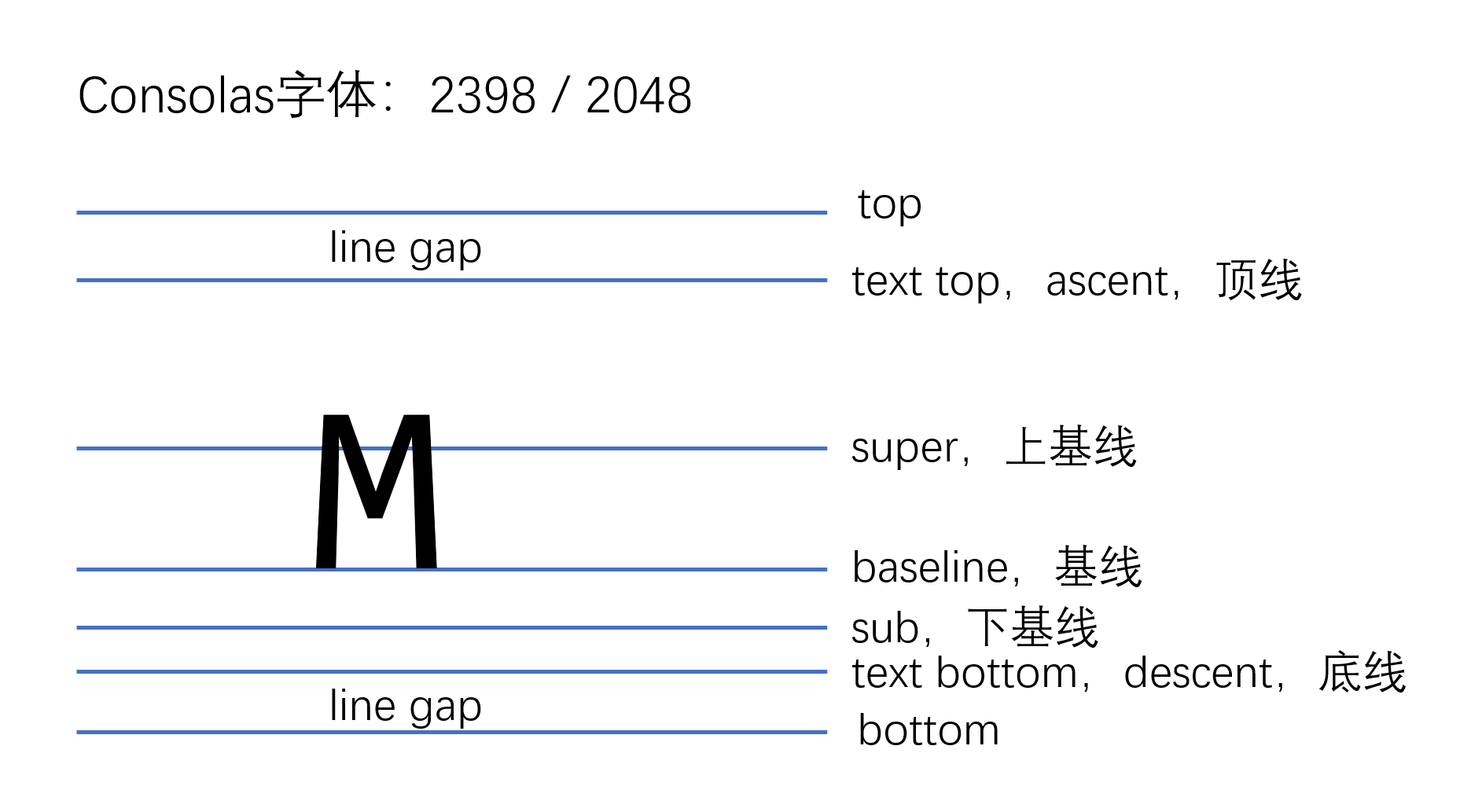
CSS中的行高设置的就是virtual-area的大小
有下面的代码
1
2
3
4
5
6
7
8
9
10
11
12
13
14
15
16
17
18
19
20
21
22
23
24
25
26
27
28
29
30
| <!DOCTYPE html>
<html lang="en">
<head>
<meta charset="UTF-8">
<meta name="viewport" content="width=device-width, initial-scale=1.0">
<meta http-equiv="X-UA-Compatible" content="ie=edge">
<title>Document</title>
<style>
body {
padding-top: 10px;
}
span {
font-size: 200px;
background: lightblue;
font-family: Consolas;
line-height: 200px;
}
p {
background: orange;
}
</style>
</head>
<body>
<p>
<span>A</span>
</p>
</body>
</html>
|
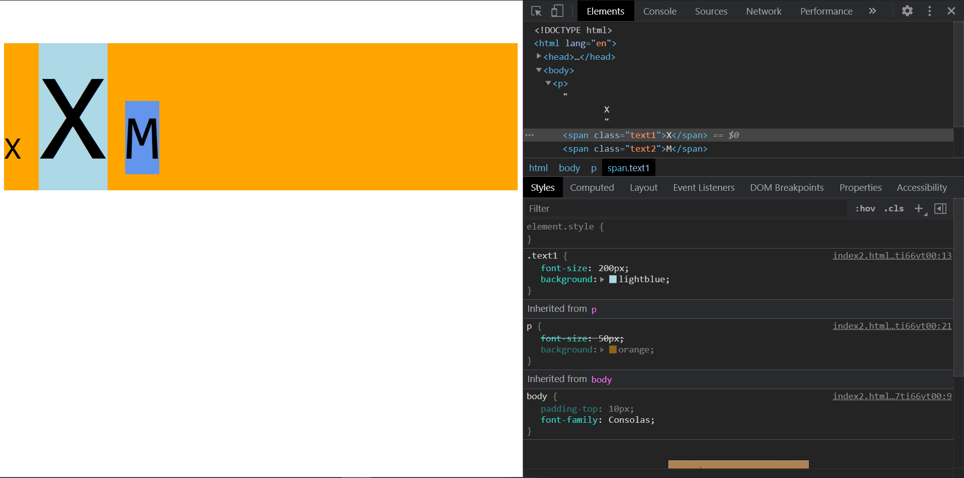
显示的结果如下
可以看到,span的高度变成了200px,也就是虚拟区的总高度,但是文字的实际内容区超过了这个范围,这时候,line gap实际上是负值
vertical-align
一个元素如果子元素出现行盒,该元素内部也会产生参考线,行盒子元素的参考线会尝试和父元素的参考线进行对齐,这种行为由vertical-align控制
vertical-align的默认值是baseline,也就是基线对齐
有下面的代码
1
2
3
4
5
6
7
8
9
10
11
12
13
14
15
16
17
18
19
20
21
22
23
24
25
26
27
28
29
30
31
32
33
34
35
36
| <!DOCTYPE html>
<html lang="en">
<head>
<meta charset="UTF-8">
<meta name="viewport" content="width=device-width, initial-scale=1.0">
<meta http-equiv="X-UA-Compatible" content="ie=edge">
<title>Document</title>
<style>
body {
padding-top: 10px;
font-family: Consolas;
}
.text1 {
font-size: 200px;
background: lightblue;
}
.text2 {
font-size: 100px;
background: cornflowerblue;
}
p {
font-size: 50px;
background: orange;
}
</style>
</head>
<body>
<p>
X
<span class="text1">X</span>
<span class="text2">M</span>
</p>
</body>
</html>
|
vertical-align的所有取值含义如下
- baseline:该元素的基线与父元素的基线对齐
- super: 该元素的基线与父元素的上基线对齐
- sub:该元素的基线与父元素的下基线对齐
- text-top: 该元素的virtual-area的顶边,对齐父元素的text-top
- text-bottom: 该元素的virtual-area的底边,对齐父元素的text-bottom
- top:该元素的virtual-area的定边,对齐line-box的顶边
- bottom:该元素的virtual-area的底边,对齐line-box的底边
- middle: 该元素的中线(content-area的一半),与父元素的X字母高度一半的位置对齐
- 数值:相对于基线的偏移量,向上为正数,向下为负数。
- 百分比:相对于基线的偏移量,百分比是相对于自身virtual-area的高度
知道一下就行orz,反正我是记不住www
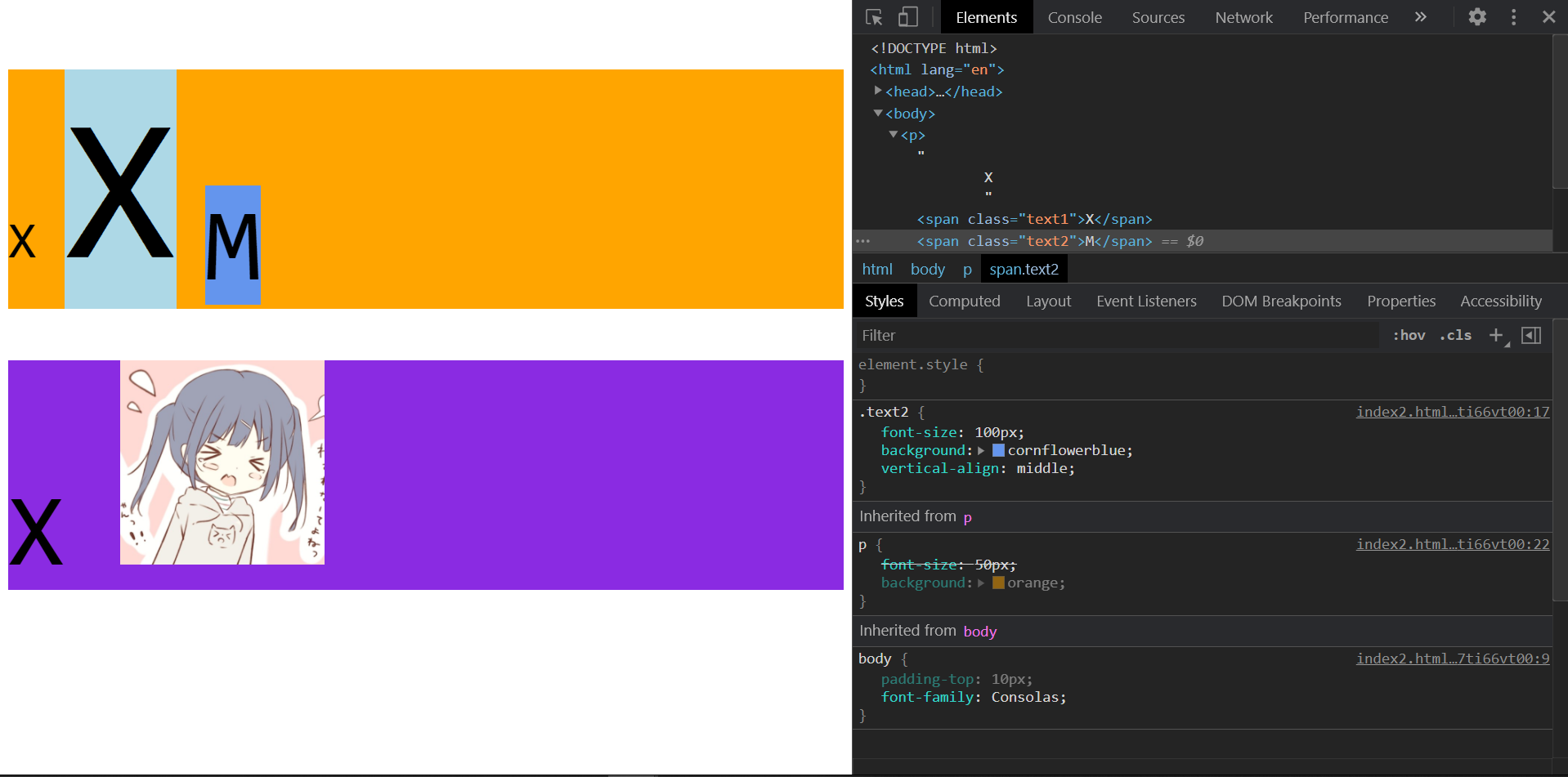
随便举个例子,我们把.text2的vertical-align改成middle
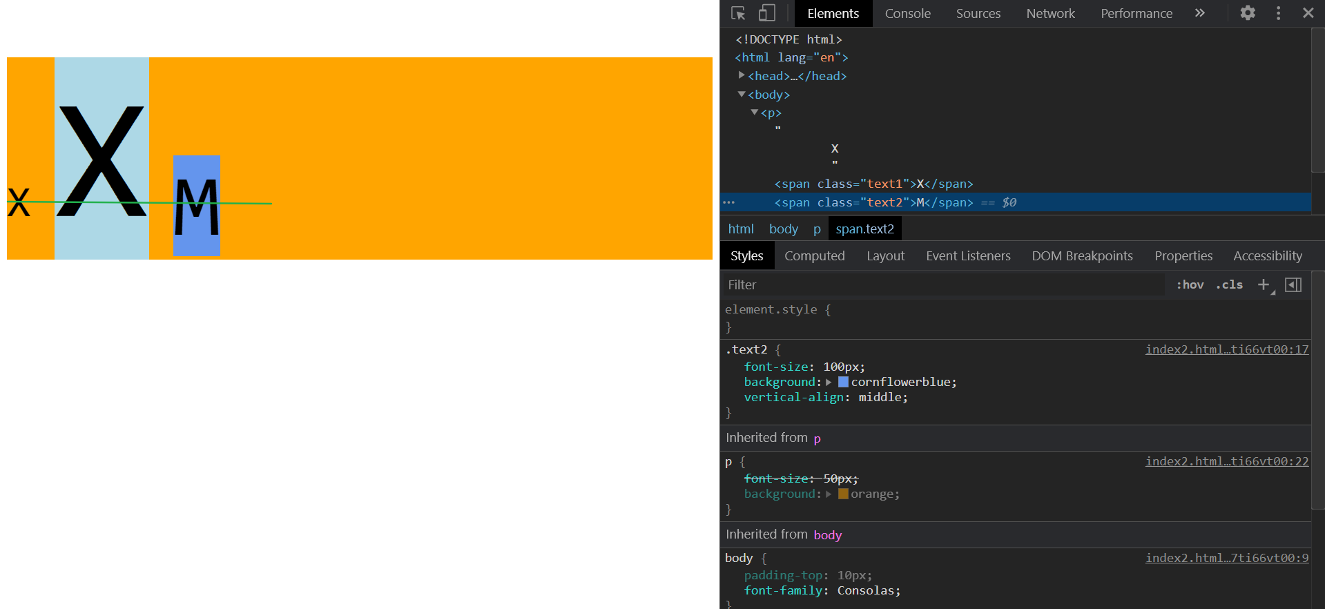
那条绿色的东西是我标上去的,可以看看效果
line-box
行盒组合起来,可以形成多行文本,每一行的区域叫做line-box,line-box的顶边是该行内所有行盒最高顶边,底边是该行行盒的最低底边。
一个元素的实际占用高度(在高度自动的情况下),高度的计算通过line-box计算。
line-box是承载文字内容的必要条件,以下情况不生成行框:
- 某元素内部没有任何行盒
- 某元素字体大小为0
图片的底部空白问题
对图片来说(图片是可替换元素,display是),基线位置位于图片的下外边距,所以在基线对齐的情况下,图片底部会有一个空隙
1
2
3
4
5
6
7
8
9
10
11
12
13
14
15
16
17
18
19
20
21
22
23
24
25
26
27
28
29
30
31
32
33
34
35
36
37
38
39
40
41
42
43
44
45
46
| <!DOCTYPE html>
<html lang="en">
<head>
<meta charset="UTF-8">
<meta name="viewport" content="width=device-width, initial-scale=1.0">
<meta http-equiv="X-UA-Compatible" content="ie=edge">
<title>Document</title>
<style>
body {
padding-top: 10px;
font-family: Consolas;
}
.text1 {
font-size: 200px;
background: lightblue;
}
.text2 {
font-size: 100px;
background: cornflowerblue;
vertical-align: middle;
}
p {
font-size: 50px;
background: orange;
}
div {
background: blueviolet;
font-size: 100px;
}
</style>
</head>
<body>
<p>
X
<span class="text1">X</span>
<span class="text2">M</span>
</p>
<div>
X
<img src="./head.png" alt="" width="200">
</div>
</body>
</html>
|
如果要解决这个问题,可以使用下面两种方法
- 设置图片的
display为block,块级元素不会参与基线对齐
- 设置父元素的
font-size为0,这样line-box就不会生成了
inline-block元素的基线
- 如果行块盒内部有行盒,用最后一行的基线作为整个行块盒的基线
- 如果行块盒内部没有行盒,则使用下外边距作为基线
如下面的例子
1
2
3
4
5
6
7
8
9
10
11
12
13
14
15
16
17
18
19
20
21
22
23
24
25
26
27
28
29
30
31
32
33
34
35
36
37
38
39
40
41
42
43
44
45
46
47
48
49
50
51
52
53
54
55
56
57
| <!DOCTYPE html>
<html lang="en">
<head>
<meta charset="UTF-8">
<meta name="viewport" content="width=device-width, initial-scale=1.0">
<meta http-equiv="X-UA-Compatible" content="ie=edge">
<title>Document</title>
<style>
body {
padding-top: 10px;
font-family: Consolas;
}
.text1 {
font-size: 200px;
background: lightblue;
}
.text2 {
font-size: 100px;
background: cornflowerblue;
vertical-align: middle;
}
p {
font-size: 50px;
background: orange;
}
.container {
background: cornflowerblue;
font-size: 40px;
}
.wrapper {
background: blueviolet;
}
.wrapper p {
font-size: 30px;
}
</style>
</head>
<body>
<p>
X
<span class="text1">X</span>
<span class="text2">M</span>
</p>
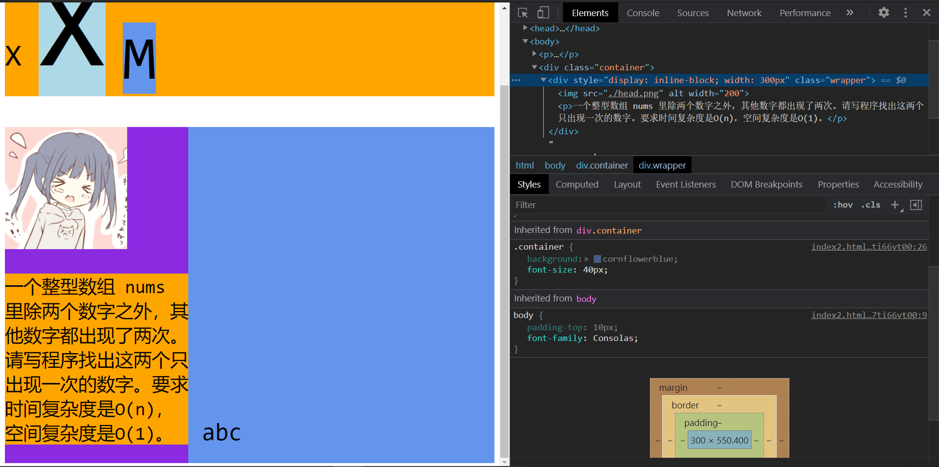
<div class="container">
<div style="display: inline-block; width: 300px" class="wrapper">
<img src="./head.png" alt="" width="200">
<p>一个整型数组 nums 里除两个数字之外,其他数字都出现了两次。请写程序找出这两个只出现一次的数字。要求时间复杂度是O(n),空间复杂度是O(1)。</p>
</div>
abc
</div>
</body>
</html>
|
运行结果
图片间的空白问题
其实这玩意和字体没啥关系,不过说到了底部空白就顺便补充一下吧
1
2
3
4
5
6
7
8
9
10
11
12
13
14
15
16
17
18
19
20
21
22
23
24
25
26
27
| <!DOCTYPE html>
<html lang="en">
<head>
<meta charset="UTF-8">
<meta name="viewport" content="width=device-width, initial-scale=1.0">
<meta http-equiv="X-UA-Compatible" content="ie=edge">
<title>Document</title>
<style>
body {
padding-top: 10px;
font-family: Consolas;
}
.container {
background: cornflowerblue;
}
</style>
</head>
<body>
<div class="container">
<img src="./head.png" alt="" width="200">
<img src="./head.png" alt="" width="200">
<img src="./head.png" alt="" width="200">
</div>
</body>
</html>
|
运行结果
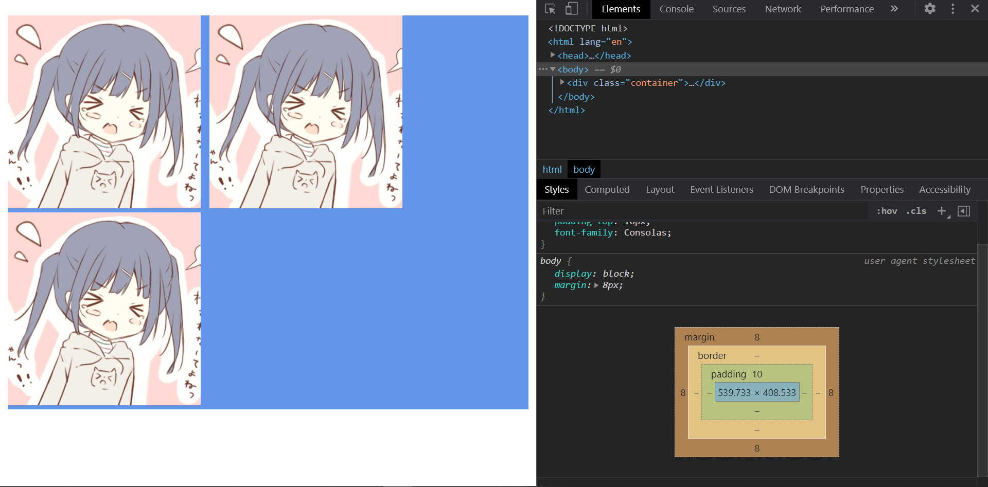
可以看到图片间是有空隙的(水平方向)
其实是因为img这种可替换元素,如果多个并排在一起,浏览器会把中间的空白字符看成一段文本,所以就会有空隙,有下面的方法
- 把
img并排写在一起,中间不要留空白
- 使用
float浮动或者flex布局
- 设置
font-size为0